Over the weekend I went to see the new horror / thriller "Sinister". I found it a useful resource for my trailer as its combination of graphic content and stalker induced tension created a good atmosphere that was similar to the one I wanted to create in our trailer.
However, I wouldn't contain as much blood and gore in my work as I want to stick to the psychological side of thrillers. I would, however, include the technique in which the camera filmed whilst a torch was shone allowing the audience to see a circle on screen that is surrounded by darkness, allowing us to easily build up tension.
Dear Moderator,
Welcome to my A2 Media blog in which I show the stages I have been through in order to create my main product, a thriller film trailer titled "Eye Spy" along with two ancillary tasks, an "Eye Spy" film poster and a magazine front cover called "Uncut" which features my film trailer. You'll find all of these completed products directly below. My Research & Planning posts start in September and my Evaluation begins on March 11th.
I hope you enjoy,
Luke
Sunday, 11 November 2012
Saturday, 10 November 2012
Wednesday, 7 November 2012
Research & Planning: Film Poster Analysis's
A long shot shows the main focus of the film which is established due to the way it dominates the entire image. The brown / golden tinge gives both a natural and a sinister feel which is emphasised with the faded background that's slightly out of focus. This adds a supernatural feel to the cabin when combined with the irregular shape and position of it. By the way the cabin is used, we can establish that this is the main threat, or maybe whatever is inside? The use of this mise-en-scene shows that this film would appeal to people aged 15-24 as it is has a modern look to it and it's also a 15 age rating. This is a typical audience for this genre as well as the mise-en-scene of the woods and the fonts used give an earthy, yet violent feel. You can tell it's a film poster due to the use of the film name, tagline, release date and production company names in Steel Tongs font.
A close up of the woman's face on the left hand side shows us that she is the protagonist. This is shown through the way she is positioned in the foreground, dominating most of the image. There is a high level of contrast cast over the entire image, giving the entire poster a darker feel that adds to the genre of thriller. The use of the house in the background implies the threat that the woman has to face throughout the film. The use of mise-en-scene shows that this film would appeal to people aged 15-24 as it looks modern and features young characters that appeal to younger generations.
A close up of the woman's face on the left hand side shows us that she is the protagonist. This is shown through the way she is positioned in the foreground, dominating most of the image. There is a high level of contrast cast over the entire image, giving the entire poster a darker feel that adds to the genre of thriller. The use of the house in the background implies the threat that the woman has to face throughout the film. The use of mise-en-scene shows that this film would appeal to people aged 15-24 as it looks modern and features young characters that appeal to younger generations.
Research & Planning: Film Name Ideas - Solvr
Film Name Ideas
http://www.a.freshbrain.com/solvr/d/33z4lkzms0
Here is a Solvr I did on some film names I liked the sound of. However, I discovered that two of my ideas have been used previously in other films which means I can use one of the others or come up with some new ones.
Research & Planning: Plan for the Week
This week I plan to:
- Create a Solvr for film name ideas
- Create two film magazine analysis's
- Add a meeting post
- Add film poster drafts
- Create some extra research posts
Sunday, 4 November 2012
Research & Planning: Production Company Logos
Here are a few production company logos that suit our genre of Psychological Thriller:
Red Letter Studios
I particularly like this image as it projects its theme well along with creating a visual highlight of the "RED" by matching it to the blood red cross logo. The use of blood red might work well in my logo to help give it a more threatening vibe.
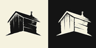
Wood Shed Studios
I like the way the logo is made up of the initials of the company as well as the fact that it is in the shape of a shed, making it even more relatable to that particular company. I should consider this when designing my own logo as well as my colour choices.
Subscribe to:
Posts (Atom)


